Rethinking “storage efficiency” in HCI architectures–Part 1

Hyper-converged infrastructures (HCI) can bring several design and operational benefits to the table, adding to the long list of reasons behind its popularity. Yet, HCI also introduces new considerations in understanding and measuring technical costs associated with the architecture. These technical costs could be thought of as a usage “tax” or “overhead” on host resources. The amount attributed to this technical cost can vary quite drastically, and depends heavily on the architecture used. For an administrator, it can be a bit challenging to measure and understand. The architecture used by HCI solutions should not be overlooked, as these technical costs can not only influence the performance and consistency of the VMs, but dramatically impact the density of VMs per host, and ultimately the total cost of ownership.

With HCI, host resources (CPU, memory, and network) are now responsible for an entirely new set of duties typically provided by a storage array found in a traditional three-tier architecture. These responsibilities not only include handling VM storage I/O from end to end, but due to the distributed nature of HCI, hosts will take part in storage activity of VMs not local to the host, such as replicated writes of a VM, as well as data at rest operations and other services related to storage. These responsibilities consume host resources. The question is, how much?

This multi-part series is going to look at the basics of HCI architectures, and how they behave differently with respect to their demands on CPU, memory, and network resources. Operational comparisons are not covered in this series simply to maintain focus on the intent of this series.

"Storage efficiency" is more than what you think
The term "storage efficiency" is commonly associated with just data deduplication and compression. With hyper-converged infrastructures, this term takes on additional meaning. Storage efficiency in HCI relates to the efficiency of how I/Os are delivered to and from the VM. Efficiency of I/O delivery to and from VMs matter not only from performance and consistency as seen by the VM, but how much resource usage is introduced to the hosts in the cluster. The latter is often never considered, yet extremely important.

HCI Architectures
HCI solutions available in today’s market not only offer different data services, but are built differently, which is just one of the many reasons why it is difficult to generalize a typical amount of overhead that is needed to process storage I/O. All HCI solutions will vary (some more than others) on how they provide storage services to the VMs while maintaining resources for guest VM activity. The two basic categories, as illustrated in Figure 1 are:

  • Virtual appliance approach. A VM lives on each host in the cluster, delivering a distributed shared storage plane, processing I/O and the other related activities. Depending on the particular HCI solution, this virtual appliance on each host may also be responsible for a number of other duties.
  • Integrated/in-kernel approach. The distributed shared storage system is a part of the hypervisor, where key aspects of the storage system are part of the kernel. This allows for virtual machine I/O to traverse through the native kernel I/O path for the hosts participating in that I/O activity.

Figure1-HCIComparison

Figure 1. Comparing an I/O write between HCI architectures (simplified for clarity)

HCI solutions that use a VM to process storage I/O on each host reside in a context (user space) that is no different than application VMs running on the host. In other words, the resources allocated to this virtual appliance to perform system level storage duties, contend for the same resources as the VMs that it is trying to serve. HCI solutions built into the hypervisor maintain end-to-end control and awareness of the I/O. Since an in-kernel, integrated solution allows I/O to traverse through the native kernel I/O path, it uses the least "costly" way to use host resources. HCI solutions built into the kernel minimize the amplification of I/Os and the CPU and memory resources it takes to process those I/Os from end to end. Sometimes virtual appliance based HCI solutions will use devices on hosts configured in the hypervisor for direct pass-through (aka “VMDirectPath”) in an attempt to reduce overhead, but many of the fundamental penalties (especially as they relate to CPU cycles) of I/O amplification through this indirect path and context switching remain.

Addressing a problem in different ways
Why are their multiple approaches? Manufacturers may state many reasons why they chose a specific approach, and why their approach is superior. Most the decision comes from technical limitations and go-to-market pressures. An HCI vendor may not have the access, or the ability to provide this functionality natively in the kernel of a hypervisor. A virtual appliance approach is easier to bring to market, and naturally adaptable to different hypervisors since it is little more than a virtual machine to process storage I/O.

By way of comparison, those who have full ownership of the hypervisor can integrate this functionality directly into the hypervisor, and when appropriate, build some aspects of it right into the kernel, just as other core functionality is built into the kernel. Resource efficiency, hypervisor feature integration, as well as the contextual awareness and control of I/O types are typically the top reasons why it is beneficial to have a distributed storage mechanism built into the hypervisor.

Do both approaches work? Yes. Do both approaches produce the same result in VM behavior and host resource usage? No. Running the same workloads using HCI solutions with these two different architectures may produce very different results on the VMs, and the hosts that serve them. The degree of impact will depend on the technical cost (in resource usage) of the I/O processing, and other data services provided by a given solution.

This difference often does not show up until numerous, real workloads are put on these solutions. Just as with a traditional storage array, every solution is fast when there is little to no load on it. What counts is the behavior under real load with contending resources. This is something not always visible with synthetic testing. For HCI environments, the overall “storage efficiency” of the particular HCI solution can be better compared (assuming identical hardware and workloads) by looking at the following in a real HCI environment running production workloads:

  • The average number of active VMs per host when running your real workloads.
  • The performance characteristics of the VMs and hosts when running your real workloads while hosts are busy serving other workloads.

These measurements above take this topic from an occasionally tiresome academic debate, and demonstrates the differences in real world circumstances. Ironically, faster hardware can increase, not reduce, the differences between these architectural approaches to HCI. This is not unlike what occurs quite often now at the application level, where faster hardware exposes actual bottlenecks in software/application design previously unnoticeable with older, slower hardware.

Now that an explanation has been given as to why "storage efficiency" really means so much more than data services like deduplication and compression, the next post in this series will focus on CPU resources in HCI environments, and what to look out for when observing CPU usage behaviors in HCI environments.

Does the concept of host resource usage interest you? If so, stay tuned for the book, vSphere 6.5 Host Resources Deep Dive by Frank Denneman and Niels Hagoort. It is surely to be a must-have for those interested in the design and optimization of virtualized environments. You can also follow updates from them at @hostdeepdive on Twitter.


Juggling priorities, and my unplanned, but temporary break from blogging

If you have a blog post for long enough, sometimes readers measure your contributions only by the number of recent posts published. If that were an accurate way to measure productivity, then apparently I haven’t been doing anything in the past few months. Quite the contrary really. Since joining VMware in August of 2016, I’ve had the opportunity to work with great teams on exciting projects. It has been fast paced, educational, and fun.

So what have I been doing anyway…
It is fair to say that VMware vSAN 6.6 is the most significant launch in the history of vSAN. The amount of features packed into 6.6 is a testament to the massive focus by R&D to deliver an unprecedented set of new features and enhancements. Part of the effort of any release is rolling out technical content. A significant amount of that load falls on Technical Marketing, and by virtue of being a part of the team, I’ve been right in the thick of it. The list of deliverables is long, but it has been fun to be a part of that process.

How vSAN is integrated into the hypervisor gives it unique abilities in integration and interoperability. An area of focus for me has been demonstrating practical examples of this integration – in particular, the integration that vSAN has with vRealize Operations, and vRealize Log Insight. Connecting the dots between what really happens in data centers, and product capabilities is one way to show how, and why the right type of integration is so important. There are a lot of exciting things coming in this space, so stay tuned.

I’ve also had the chance to join my colleagues, Pete Flecha and John Nicholson on the Virtually Speaking Podcast. In episode 38, we talked a little about storage performance, and in episode 41, we discussed some of the new features of vSAN 6.6. What John and Pete have been able to accomplish with that podcast over the past year is impressive, and the popularity of it speaks to the great content they produce.

Since joining VMware, I also stepped down from my role as a Seattle VMUG leader. It was a fun and educational experience that helped me connect with the community, and appreciate every single volunteer out there. VMUG communities everywhere are run by enthusiasts of technology, and their passion is what keeps it all going. I appreciated the opportunity, and they are in good hands with Damian Kirby, who has taken over leadership duties.

All of these activities, while gratifying, left little time for my normal cadence of posts. I’ve always enjoyed creating no-nonsense, interesting, unique content with a lot of detail. Testing, capturing observations, and investigating issues is fun and rewarding for me, but it is also extremely time consuming. I spent the past 8 years churning out this type of content at a clip of about one post per month. That doesn’t sound like much, but with the level of detail and testing involved, it was difficult to keep up the pace recently. This short reprieve has allowed me to rethink what I want my site to focus on. While much of the content I’m producing these days shows up in other forms, and in other locations, I’ll now have the chance to mix up the content out here a bit. Some new posts are in the works, and hope to pick up the pace soon, if for nothing else, to let everyone know I’m actually doing something. Smile

– Pete

Helpful Links

vSAN in cost effective independent environments

Old habits in data center design can be hard to break.  New technologies are introduced that process data faster, and move data more quickly.  Yet all too often, the thought process for data center design remains the same – inevitably constructed and managed in ways that reflect conventional wisdom and familiar practices.  Unfortunately these common practices are often due to constraints of the technologies that preceded it, rather than aligning the current business objectives with new technologies and capabilities.

Historically, no component of an infrastructure dictated design and operation more than storage.  The architecture of traditional shared storage often meant that the storage infrastructure was the oddball of the modern data center.  Given enough capacity, performance, and physical ports on a fabric, a monolithic array could serve up several vSphere clusters, and therein lies the problem.  The storage was not seen or treated as a clustered resource by the hypervisor like compute.  This centralized way of storing data invited connectivity by as many hosts as possible in order to justify the associated costs. Unfortunately it also invited several problems.  It placed limits on data center design because in part, it was far too impractical to purchase separate shared storage for every use case that would benefit from an independent environment isolated from the rest of the data center.  As my colleague John Nicholson (blog/twitter) has often said, "you can’t cut your array in half."  It’s a humorous, but cogent way to describe this highly common problem.

vSANWhile VMware vSAN has proven to be extremely well suited for converging all applications into the same environment, business requirements may dictate a need for self contained, independent environments isolated in some manner from the rest of the data center.  In "Cost Effective Independent Environments using vSAN" found on VMware’s StorageHub, I walk through four examples that show how business requirements may warrant a cluster of compute and storage dedicated for a specific purpose, and why vSAN is an ideal solution.  The examples provided are:

  • Independent cluster management
  • Development/Test environments
  • Application driven requirements
  • Multi-purpose Disaster Recovery

Each example listed above details how traditional storage can fall short in delivering results efficiently, then compares how vSAN addresses and solves those specific design and operational challenges. Furthermore, learn how storage related controls are moved into the hypervisor using Storage Policy Based Management (SPBM), VMware’s framework that delivers storage performance and protection policies to VMs, and even individual VMDKs, all within vCenter.  SPBM is the common management framework used in vSAN and Virtual Volumes (VVols), and is clearly becoming the way to manage software defined storage.  Each example wraps up with a number of practical design tips for that specific scenario in order to get you started in building a better data center using vSAN.

Clustering is an incredibly powerful concept, and vSphere clusters in particular bring capabilities to your virtualized environment that are simply beyond comparison.  With VMware vSAN, the power of clustering resources are taken to the next level, forming the next logical step in the journey of modernizing your environment in preparation for a fully software defined data center.

This use case published is the first of many more to come that are focused on practical scenarios reflecting common needs of organizations large and small, and how vSAN can help deliver results, quickly and effectively.  Stay tuned!

– Pete

Accommodating for change with Virtual SAN

One of the many challenges to proper data center design is trying to accommodate for future changes, and do so in a practical way. Growth is often the reason behind change, and while that is inherently a good thing, IT budgets often don’t see that same rate of increase. CFO’s expect economies of scale to make your environment more cost efficient, and so should you.

Unfortunately, applications are always demanding more resources. The combination of commodity x86 servers and virtualization provided a flexible way to accommodate growth when it came to compute and memory resources, but addressing storage capacity and storage performance was far more difficult. Hyper-converged architectures helped break down this barrier somewhat, but some solutions lacked flexibility to cope with increasing storage capacity or performance beyond the initial prescribed configurations defined by a vendor. Users need a way to easily increase their HCI storage resources in the middle of a lifecycle without always requesting for yet another capital expenditure.

“A customer can have a car painted any color he wants as long as it’s black” — Henry Ford

But wait… it doesn’t always have to be that way. Take a look at my post on Virtual Blocks on Options in scalability with Virtual SAN. See how VSAN allows for a smarter way to approach your evolving resource needs, giving the power of choice in how you scale your environment back to you. Whether you choose to build your own servers using the VMware compatibility guide, go with VSAN Ready Nodes, or select from one of the VxRAIL options available, the principals described in the post remain the same. I hope it sparks a few ideas on how you can apply this flexibility in a strategic way to your own environment.

Thanks for reading…

The success of VSAN, and my move to VMware

For the past few years, I’ve had the opportunity to share with others how to better understand their Data Center workloads, and how to use this knowledge to better service the needs of their organizations.  As a Technical Marketing Engineer for PernixData, the role allowed me to maintain a pulse on the needs of the customers and the partners, as well as analyze what others were doing from a competitive standpoint. It was a great way to distinguish between industry hyperbole, versus what solutions people were really interested in, and implementing.

One observation simply couldn’t be ignored. It was clear that many were adopting VMware VSAN – and doing it in a big way. The rate of adoption even seemed to outpace the exceptionally rapid rate the product has been maturing. Thinking back to my days on the customer side, it was easy to see why. With its unique traits by virtue of it being built into the hypervisor, it appeals to the sensibilities of the Data Center Administrator, and the CFO. VSAN was resonating with the needs of the customers, and doing so in a much more tangible way than official market research numbers could describe.

I wanted to be a part of it.

With that, I’m thrilled to be joining VMware’s Storage and Availability business unit, as a member of their Technical Marketing Team. One of my areas of focus will be VSAN, as well as many other related topics. I’m joining the likes of GS Khalsa, Jase McCarty, Jeff Hunter, John Nicholson, Ken Werneburg, and Pete Flecha. To say it’s a honor to be joining this team is a bit of an understatement.  I’m truly grateful for the opportunity.

A special thanks to all of the great people I worked with at PernixData. An incredibly talented group of people striving to make a difference. The best of luck to each and every one of them. It’s been a truly rewarding experience indeed.

You’ll be able to my official contributions out on VMware’s Virtual Blocks and as well as other locations. I’ll be continuing to post out here at vmPete.com for unofficial content, and other things that continue to interest me.

Onward…

How CPU related metrics in vSphere may be misinterpreted

Most Data Center Administrators are accustomed to looking for high CPU utilization rates on VMs, and the hosts in which they reside. This shouldn’t be a big surprise. After all, vCenter, and other monitoring tools have default alarms to alert against high CPU usage statistics. Features like DRS, or products that claim DRS-like functionality factor in CPU related metrics as a part of their ability to redistribute VMs under periods of contention. All of these alerts and activities suggest that high CPU values are bad, and low values are good. But what if conventional wisdom on the consumption of CPU resources is wrong?

Why should you care
Infrastructure metrics can certainly be a good leading indicator of a problem. Over the years, high CPU usage alarms have helped correctly identified many rogue processes on VMs ("Hey, who enabled the screen saver via GPO?…"). But a CPU alarm trigger assumes that high CPU usage is always bad. It also implies that the absence of an alarm condition means that there is not an issue. Both assumptions can be incorrect, which may lead to bad decision making in the Data Center.

The subtleties of performance metrics can reveal problems somewhere else in the stack – if you know how and where to look. Unfortunately, when metrics are looked at in isolation, the problems remain hidden in plain sight. This post will demonstrate how a few common metrics related to CPU utilization can be misinterpreted. Take a look at the post Observations with the Active Memory metric in vSphere to see how this can happen with other metrics as well.

The testing
There are a number of CPU related metrics to monitor in the hypervisor, and at least a couple of different ways to look at them (vCenter, and esxtop). For brevity, lets focus on two metrics that readily visible in vCenter; CPU Usage and CPU Ready. This doesn’t dismiss the importance of other CPU related metrics, or the various ways to gather them, but it is a good start to understanding the relationship between metrics. As a quick refresher, CPU Usage as it relates to vCenter has two definitions. From the host, the usage is the percentage of CPU cycles in use against the total CPU cycles available on the host. On the VM, usage shows the percent of CPU resources in use against the total available CPU cycles of the vCPUs visible to the VM. CPU Ready in vCenter measures in summation form, the amount of time that the virtual machine was ready, but could not get scheduled to run on the CPU.

A few notes about the test conditions and results:

  • The tests here comprise of activities that are scheduled inside each guest, and are repeated 5 times over a 1 hour period.
  • There are no synthetic tools used here to generate storage I/O load or consume CPU cycles. (iometer, StressLinux, etc.)
  • The activities performed are using processes that are only partially multithreaded. This approach is most reflective of real world environments.
  • The "slower" storage depicted in the testing were actually SSDs, while the "faster" storage was by leveraging PernixData FVP and distributed fault tolerant memory (DFTM) as a storage acceleration tier.
  • The absolute numbers are not necessarily important for this testing. The focus is more about comparing values when a variable like storage performance changes.
  • No shares, reservations, or limits were used on the test VMs.

The complex demands of real world environments may exhibit a much greater impact than what the testing below reveals. I reference a few actual cases of production workloads later on in the post. Synthetic load generators were not used here because they cannot properly simulate a pattern of activity that is reflective of a real environment. Synthetic load generators are good at stressing resources – not simulating real world workloads, or the time it takes for those workloads to complete their tasks.

Interpreting impacts on CPU usage and CPU Ready with changing storage performance
Looking at CPU utilization can be challenging because not all applications, nor the workloads they generate are the same. Most applications are a complex mix of some processes being multithreaded, while others are not. Some processes initiate storage I/O, while others do not. It is for this reason that we will look at CPU Usage and CPU Ready over a task that is repeated on the same sets of VMs, but using storage that performs differently.

For all practical purposes, CPU Ready doesn’t become meaningful until a host is running a large number of single vCPU VMs concurrently, or a number of multiple vCPU VMs concurrently. CPU Ready can sometimes be terribly tricky to decipher because it can be influenced in so many ways. Sometimes it may align with CPU utilization, while other times it may not. It may be affected by other resources, or it may not. It really depends on the environmental conditions. I find it a good supporting metric, but definitely not one that should stand on its own merit, without proper context of other metrics. We are measuring it here because it is generally regarded as important, and one that may contribute to load distribution activities.

Test 1: Single vCPU VM on a Host with no other activity
First let’s look at one of the very simplest of comparisons. A single vCPU VM with no other activity occurring on the host, where one test is using slower storage (blue), and the other test it is using faster storage (orange). A task was completed 5 times over the course of one hour. The image below shows that from the host perspective, peak CPU utilization increased by 79% when using the faster storage. CPU Ready demonstrated very little change, which was as expected due to the nature of this test (no other VMs running on the host).

hoststats-1vcpu

When we look at the individual VMs, the results are similar. The images below show that CPU usage maximums for the VM increased by 24% when using the faster storage. CPU Ready demonstrated very little change here because there were no other VMs to contend with on that host. The "Storage Latency" column shows the average storage latency the VM was seeing during this time period.

vmstats-1vcpu

You might think that higher latency may not be realistic of today’s storage technologies. The "slower" storage in this case did in fact come from SSD based storage. But remember that Flash of any kind can suffer in performance when committing larger block I/O which is quite common with real workloads. Take a look at "Understanding block sizes in a virtualized environment" for more information.

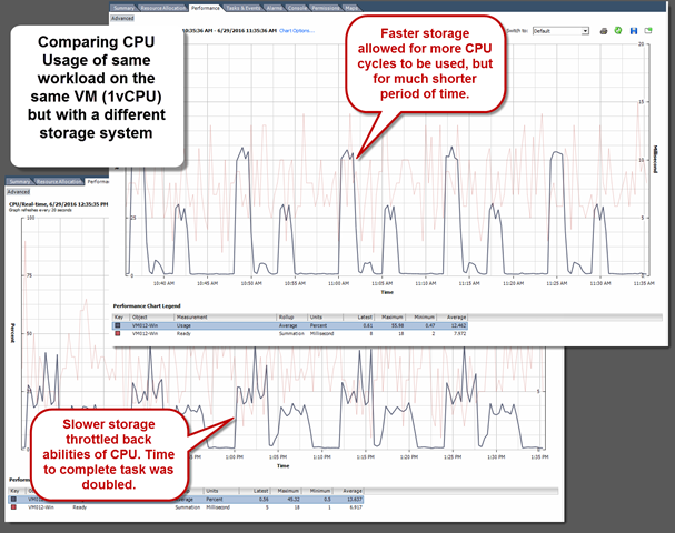
But wait… how long did the task, set to run 5 times over the period of one hour take? Well, the task took just half the time to run with the faster storage. The same amount of cycles were processing the same amount of I/Os, but just for a shorter period of time. This faster completion of a task will free up those CPU cycles for other VMs. This is the primary reason why the averages for CPU Usage and CPU Ready changed very little. Looking at this data in a timeline form in vCenter illustrates it quite clearly. There is a clear distinction of the characteristics of the task on the fast storage. Much more difficult to decipher on the run with slower storage.

combined-singlevCPU

Test 2: Multiple vCPU VM on a host with other activity
Now let’s let the same workload run on VMs with assigned multiple (4) vCPUs, along with other multi-vCPU VMs running in the background. This is to simulate a bit of "chatter" or activity that one might experience in a production environment.

As we can see from the images below, on the host level, both CPU usage and CPU ready values increased as storage performance increased. CPU usage maximums increased by 39% on the host. CPU Ready maximums increased by 34% on the host, which was a noticeable difference than testing without any other systems running.

hoststats-4vcpu

When we look at the individual VMs, the results are similar. The images below show that CPU usage maximums increased by 39% with the faster storage. CPU Ready maximums increased by 51% while running on the faster storage. Considering the typical VM to host consolidation ratio, the effects can be profound.

vmstats-4vcpu

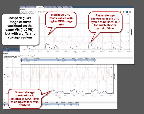
Now let’s take a look at the timeline in vCenter to get an appreciation of how those CPU cycles were used. On the image below, you can see that like the single vCPU VM testing, the VM running on faster storage allowed for much higher CPU usage than when running on slower storage, but that it was for a much shorter period of time (about half). You will notice that in this test, the CPU Ready measurements generally increases as the CPU usage increased.

combined-multivCPU

Real world examples
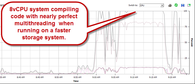
This all brings me back to what I witnessed years ago while administering a vSphere environment consisting of extremely CPU and storage I/O intensive workloads. Dozens of resource intensive VMs built for the purpose of compiling code. These were systems using that could multithread to near perfection – assuming storage performance was sufficient.

fasterprocess

Now let’s look at what CPU utilization rates looked like on that same VM, running the same code compiling job where the storage environment wasn’t able to satisfy reads and writes fast enough. The same job took 46% longer to complete, all because the available CPU cycles couldn’t be used.

longprocess

Still not a believer? Take a look at a presentation at the OpenStack summit by Charter Communications in April 2016, where they demonstrate exactly the effect I describe. Their Cassandra cluster deployed with VMware Integrated OpenStack, and the effects of CPU utilization when providing lower latency, higher performing storage. (key information beginning at 17:10). Their more freely breathing storage allowed CPU cycles related to storage I/O to be committed more quickly, thereby finishing the tasks much more quickly. High CPU usage was a desired result of theirs.

You might be thinking to yourself, "Won’t I have more CPU contention with faster storage?"   Well, yes and no. Faster storage will give power back to the Administrator to control the usage of resources as needed, and deliver the SLAs required. And moving the point of contention to the CPU allows for what it does best; time slicing processes to complete the tasks as quickly as possible.

Sample what?
The rate at which telemetry data is sampled is a factor that can dramatically change your impression of the behavior of these resources used in the Data Center. It’s a big topic, and one that will be touched on in an upcoming post, but there is one thing to note here. When leveraging faster, lower latency storage, there are many times where CPU utilization and CPU Ready will stay the same. Why? In a real workload that involve CPU cycles executing to commit storage I/O, a workflow can may consist of a given amount of those I/Os, regardless of how long it takes. If that process took 18 seconds on slow storage, but 5 seconds on faster storage, the 20 second sampling rate within vCenter may render it in the same way. One often has to employ other tools to see these figures at a higher sampling rate. Tools such as vscsiStats and esxtop are good examples of this.

Takeaways
The testing, and examples above should make it easy to imagine a scenario in which a storage system is upgraded, and CPU related alarms are tripped more frequently, even though the processes that support a workflow have completed much more quickly. So with that, it’s good to keep the following in mind.

  • Slow storage will suppress CPU utilization rates – giving you the impression that from a host, or VM perspective, everything is fine.
  • Conversely, Fast storage will allow those CPU cycles related to storage I/O to execute, thereby increasing utilization rates – albeit for a shorter period of time.  High CPU statistics are not necessarily a bad thing.
  • Averages and peaks can be misleading because increased utilization rates may not be recognizable in the vCenter CPU charts if it completes within the smallest sampling size (20 seconds)
  • Traditional methods of monitoring and balancing host resources can be misleading
  • Higher CPU utilization rates may not be a leading indicator of an issue. They are often be a trailing indicator of well-designed processes, or free breathing storage. Again, high CPU can be a good thing!!!
  • Application behavior, and the results are what counts. If a batch job in SQL takes 30 minutes, defining success should be around the desired time of that batch job. Infrastructure related metrics should help you diagnose issues and assist with achieving a desired result, but not be the one and only KPI.
  • Storage performance will generally impact every VM and host accessing the cluster. Whereas host based resource contention will only impact other VMs living on that same host.

Thanks for reading

– Pete

What does your infrastructure analytics really tell you?

There is no mistaking the value of data visualization combined with analytics.  Data visualization can help make sense of the abstract or information not easily conveyed by numbers.  Data analytics excels at taking discrete data points that make no sense on their own, into findings that have context, and relevance.  The two together can present findings in a meaningful, insightful, and easy to understand way.  But what are your analytics really telling you?

The problem for modern IT is that there can be an overabundance of data, with little regard to the quality of data gathered, how it relates to each other, and how to make it meaningful.  All too often, this "more is better" approach obfuscates the important to such a degree that it provides less value, not more.  it’s easy to collect data.  The difficulty is to do something meaningful with the right data.  Many tools collect metrics in an order not by which is most important, but what can be easily provided.

Various solutions with the same problem
Modern storage solutions have increased their sophistication in their analytics offerings for storage.  In principle this can be a good thing, as storage capacity and performance is such a common problem with today’s environments.  Storage vendors have joined the "we do that too" race of analytics features.  However, feature list checkboxes can easily mask the reality – that the quality of insight is not what you might think it is.  Creative license gets a little, well, creative.

Some storage solutions showcase their storage I/O analytics as a complete solution for understanding storage usage and performance of an environment.  Advertising an extraordinary amount of data points collected, and sophisticated methods for collection of that data that is impressive by anyone’s standards.  But these metrics are often taken at face value.  Tough questions need to be asked before important decisions are made off of them.  Is the right data being measured?  Is the data being measure from the right location?  Is the data being measured in the right way?  And is the information conveyed of real value?

Accurate analytics requires that the sources of data are of the right quality and completeness.  No amount of shiny presentation can override the result of using the wrong data, or using it in the wrong way.

What is the right data?
The right data has a supporting influence on the questions that you are trying to answer.  Why did my application slow down after 1:18pm? How did a recent application modification impact other workloads?  In Infrastructure performance, I’ve demonstrated how block sizes have historically been ignored when it came to storage design, because they could not have been easily seen or measured.  Having metrics around fan speed of a storage array might be helpful for evaluating your cooling system in your Data Center, but does little to help you understand your workloads.  The right data must also be collected at a rate that accurately reflects the real behavior.  If your analytics offerings sample data once every 5 or 10 minutes, how can it ever show spikes of contention in resources that impact what your systems experience?  The short answer is, they can’t.

The importance of location
Measuring the data at the right location is critical to accurately interpreting the conditions of your VMs, and the infrastructure in which they live.  We perceive much more than we see.  This is demonstrated most often with a playful optical illusion, but can be a serious problem with understanding your environment.  The data gathered is often incomplete, and how you perceived it by virtue of assuming it was all the data you need all lead to the wrong conclusion.  Let’s consider a common scenario where the analytics of a storage system shows great performance of a storage array, yet the VM may be performing poorly.  This is the result of measuring from the wrong location.  The array may have showed the latency of the components inside the device, but cannot account for latency introduced throughout the storage stack.  The array metric might have been technically accurate for what it was seeing, but it was not providing you the correct, and complete metric.  Since storage I/O always originate on the VMs and the infrastructure in which they live, it simply does not make sense to measure them from a supporting component like a storage array.

Measuring data inside the VM can be equally as challenging.  Operating Systems’ method of data collection assume they are the sole proprietor of resources, and may not always accurately account for that fact that it is time slicing CPU clock cycles with other VMs.  While the VM is the end "consumer" of resource, it also does not understand it is virtualized, and cannot see the influence of performance bottlenecks throughout the virtualization layer, or any of the physical components in the stack that support it.

VM metrics pulled from inside the guest OS may measure thing in different ways depending on Operating System.  Consider the differences in how disk latency in Windows "Perfmon" is measured versus Linux "top."  This is the problem with data collector based solutions that aggregate metrics from difference sources.  A lot of data collected, but none of it means the same thing.

This disparate data leaves users attempting to reconcile what these metrics mean, and how they impact each other.  Even worse when supposedly similar metrics from two different sources show different data.  This can occur with storage array solutions that hook into vCenter to augment the array based statistics.  Which one is to be believed?  One over the other, or neither?

Statistics pulled solely from the hypervisor kernel avoids this nonsense.  It provides a consistent method for gathering meaningful data about your VMs and the infrastructure as a whole.  The hypervisor kernel is also capable of measuring this data in such a way that it accounts for all elements of the virtualization stack.  However, determining the location for collection is not the end-game.  We must also consider how it is analyzed.

Seeing the trees AND the forest
Metrics are just numbers.  More is needed than numbers to provide a holistic understanding for an environment.  Data collected that stands on its own is important, but how it contributes to the broader understanding of the environment is critical.  One needs to be able to get a broad overview of an environment to drill down and identify a root cause of an issue, or be able to start out at the level of an underperforming VM and see how or why it may be impacted by others.

Many attempt to distill down this large collection of metrics to just a few that might help provide insight into performance, or potential issues.  Examples of these individual metrics might include CPU utilization, Queue depths, storage latency, or storage IOPS.  However, it is quite common to misinterpret these metrics when looked at in isolation.

Holistic understanding provides its greatest value when attempting to determine the impact of one workload over a group of other workloads.  A VM’s transition to a new type of storage I/O pattern can often result in lower CPU activity; the exact opposite of what most would look for.  The weight of impact between metrics will also vary.  Think about a VM consuming large amounts of CPU.  This will generally only impact other VMs on that host.  In contrast, a storage based noisy neighbor can impact all VMs running on that storage system, not just the other VMs that live on that host.

Conclusion
Whether your systems are physical, virtualized, or live in the cloud, analytics exist to help answer questions, and solve problems.  But analytics are far more than raw numbers.  The value comes from properly digesting and correlating numbers into a story providing real intelligence.  All of this is contingent on using the right data in the first place.   Keep this in mind as you think about ways that you currently look at your environment.

Solarize your Home Lab, and your Home

A notorious trait of vSphere Home Labs is that they start out simple and modest, then evolve into something looking like a small Data Center. As the Home Lab grows in size and sophistication, eventually elements such as power, cooling, and noise can become a problem. IT folks are typically technology geeks at heart, so the first logical step at addressing a problem introduced by one technology is to… well, tackle it with another technology. This post isn’t necessarily about my Home Lab, but how I’ve chosen to power my home where the lab runs. That would be by the use of a residential solar system. A few have asked for me to provide some information on the setup, so here it is.

My interest in solar goes back as far as I can remember. As a young boy I watched my father build four 4’x8′ panels filled with copper tubing to supplement the natural gas furnace providing hot water. It turns out that wasn’t his first adventure with solar. Growing up in the plains of the Midwest during the heart of the Great Depression in the 1930s, he cobbled together what was a crude sort of solar system so his family could have a hot water to a shower outside. I marveled at his ingenuity.

Basics of a modern residential solar system
Residential solar systems typically consist of a collection of panels housing Photovoltaic (PV) cells, connected in series, generating DC current. Each panel has a wattage rating. My panels; 20 in total, are made by Itek Energy, and rated at 280 Watts per panel. Multiplied by 20, this gives a potential to generate 5.6kW in direct sunlight, and optimal orientation. Most PV solar is inherently DC, so this needs to be converted to AC via inverter. Converting DC to AC or vice versa usually has some cost on efficiency. Considering that most electronic devices are DC, and have a transformer of their own, this is a humorous reminder that Thomas Edison and Nikola Tesla are still battling it out after all these years.

Typically solar panels are mounted on a generally south facing side to collect as much direct sunlight as possible. Ideally, the panels would always be perpendicular to the orientation and angle to the sun. With fixed mounting on a roof, this just isn’t going to happen. But fixed mounting in non-ideal situations can still yield good results. For instance, even though my roof has a far from perfect orientation, the results are impressive. An azimuth of 180 degrees would be true South, and considered ideal in the northern hemisphere. My azimuth is 250 degrees (on a 6:12 pitch roof), meaning that it is facing 70 degrees westward from being ideal. However, my 5.6kW solar system peaks out at around 5.2kW, and catches more afternoon light than morning light, often better in areas that may have morning fog or marine air. This less than perfect orientation is estimated to only have a 10% reduction of the total production output of the panels over the course of a year. The 400 Watt shortage from it’s rated maximum is the result of loss from the inverter transitioning it over to AC, as well as some loss to atmospheric conditions.

Sizing of residential solar systems is often the result of the following design requirements and constraints. 1.) How many panels can fit on a roof with ideal orientation. 2.) What is your average electricity usage per day (in kWh), and 3.) What state incentives would make for the ideal size of a system.

The good news is that sizing a system, and estimating the capabilities is far more sophisticated than just guesswork. Any qualified installer will be able to run the numbers for your arrangement and give you full ROI estimates. The National Energy Renewable Laboratory (NREL) has a site that allows you to plug in all of your variables, and also factors in local weather data to provide detailed analysis of a proposed environment.

Grid tied versus Battery backed
Many, if not most residential solar installations these days are grid tied systems. This means that the solar supplements your power from the grid in such a way that the needs of the home will consume the power from the panels, and if there is an overabundance of power generated from the panels, it will feed this back into the grid, and bill your power provider. This is called "net metering" and provides an experience that is seamless to the consumer. One would want to be a bit careful as to not oversize grid tied systems, because some power providers may have caps on net metering and how much they pay you for electricity generated.

A residential solar system may also be battery backed. The benefit to this of course would be full independence from getting power from the grid. However, this introduces capital and operational costs not associated with grid tied systems. The system may have to be sized larger to ensure adequate power on those days where the panels don’t have the ability to generate as much electricity as you hoped for. Battery backed systems may or may not be eligible for some of the subsidies in your area. Grid tied systems prevent the need for one to have this infrastructure, and in many ways, can be thought of as the battery backup to your home when your solar power is not generating enough electricity.

How to know how well it is working
Thanks to modern technology, monitoring solutions can give you full visibility into the performance of your solar panels. My system uses an eGauge Systems Data logger. Since most of my career in IT has involved interpreting graphs and performance data in an attempt to understand systems better, monitoring the system has been one of the more entertaining aspects of the process. One can easily see via Web interface, how much load is being drawn by activities in your home, and how much power is being generated by the solar. The eGauge solution offers quick and easy access to monitoring of the environment via mobile devices, or web browser. Entering in all of your variables will also help it determine how much money you are saving for any given period of time. As the image shows below, it is easy to see how much load the home is consuming (the red fill, how much the solar system is generating (green fill), and how it is either offsetting the load, or feeding back power into the grid system.

Below is a view of a 6 hour window of time. The data is extremely granular; collected and rendered once per second.

6hour

The view below is for a 24 hour period. As you can see from the figures, a sunny day in May produces over 35kWh per day

day

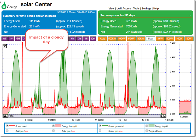
The image below is a view over a one week period. You can certainly see the influence of cloudy days. As one changes the time period, the UI automatically calculates what you are saving (excluding State production incentives)

week

In case you are curious, my 6 node vSphere home lab is on 24×7, and consumes between 250 and 300 Watts (6.5kWh per day), so that is some of what contributes to the continuous line of red, even when there isn’t much going on in the house.

Economics of Solar
It is an understatement to say that the economics of residential solar varies widely. Geographic location, roof orientation, roof pitch, surface area, weather patterns, federal incentives, state incentives, and electricity rates all play a part in the equation of economic viability. Let’s not forget that much like recycling, or buying a hybrid vehicle, some people do it for emotional reasons as well. In other words, it might make them feel good, regardless if it is a silly financial decision or not. That is not what was driving me, but it would be naive to overlook that this influences people. Incentives typically fall into three categories.

  • Federal incentives. This currently is a 30% rebate at the end of the year on your up-front cost of the entire system.
  • State Incentives. Some States include some form of a production incentive program. This means that for every kWh of energy produced (whether you use it or not), you may receive a payment for the amount produced. This can be at some pre negotiated rate that is quite lucrative. Production incentives in the State of Washington can go as high as 54 cents per kWh, but may have limited terms. State incentives also may include waiving sales tax on all equipment produced in the state.
  • Power provider incentives. This comes in the form of Net metering, and simply charge the power company for every kWh that you produce, but do not use. This is often at a rate equal to what they charge you for power. (e.g. 10 cents per kWh).
    Realistically, the State and power provider incentives are heavily tied to each other, as power companies are a heavily regulated State entity.

Usually it is the State incentives or high power rates in a State are what make solar economically viable. These incentives can make an investment like this have a break-even period that is very reasonable. If there are no State incentives, and you have dirt cheap power from the grid, then it becomes a much tougher sell. This is often where battery backed systems with cheaper Chinese manufactured panels come into play. It is a rapidly changing industry, and depends heavily on legislation in each State. Is solar right for you? It depends on many of the conditions stated above. It’s really best to check with a local installer who can help you determine if it is or not. I used Northwest Wind & Solar to help work through that process, as well as installation of the system.

Observations in production
Now that things have been up and running for a while, there are a few noteworthy observations worth sharing:

  • The actual performance of solar varies widely. Diffused sunlight, or just daylight will certainly generate power, but it may be only 10 % to 20% of potential of the panel. This is one of the reason why power generated can fluctuate so widely.
  • Solar requires a lot of surface area. This was no surprise to me because of my past experience buying small, deck of card sized panels from Radio Shack in my youth. Each of my 20, Itek panels measure out at 3’x5′ per panel and produce 280W in theoretically ideal conditions. Depending on your average daily consumption of energy, you might need between 15 and 40 panels just to accommodate energy utilization rates. Because of this need for a large surface area, incorporating solar into objects such as vehicles is gimmickry at best (yes, I’m talking to you Toyota) and plays into emotions more than it does providing any practical benefit.
  • Monitoring of your power is pretty powerful. Aside from the cool factor of the software that allows you to see how much energy is generated, you also quickly see the realities of some items in your household. Filling a house full of LEDs might reduce your energy consumption and make you feel good along the way, but a few extra loads in of laundry in the dryer, or a bit trigger happy with the A/C unit in your home will quickly offset those savings.
  • Often a crystal clear sunny day does not yield the highest wattage of power generation. The highest peak output comes on partly sunny days. I suspect the reason is that there is less interference in the atmosphere in those partly sunny days. For me, those partly sunny days that may peak the power generation of my system at 5.25kW, will often be only about 4.6kW at its highest on what would be thought of as a crystal clear blue sky day.

Determining whether or not to invest in residential solar is really no different than making a smart design decision in the Data Center. Use data, and not emotions to drive the decision making, then follow that up with real data analysis to determine its success. This approach helps avoid the "trust us, it’s great!" approach found all too often in the IT industry and beyond.

Viewing the impact of block sizes with PernixData Architect

In the post Understanding block sizes in a virtualized environment, I describe what block sizes are as they relate to storage I/O, and how it became one of the most overlooked metrics of virtualized environments.  The first step in recognizing their importance is providing visibility to them across the entire Data Center, but with enough granularity to view individual workloads.  However, visibility into a metric like block sizes isn’t enough. The data itself has little value if it cannot be interpreted correctly. The data must be:

  • Easy to access
  • Easy to interpret
  • Accurate
  • Easy to understand how it relates to other relevant metrics
    Future posts will cover specific scenarios detailing how this information can be used to better understand, and tune your environment for better application performance. Let’s first learn how PernixData Architect presents block size when looking at very basic, but common read/write activity.

Block size frequencies at the Summary View
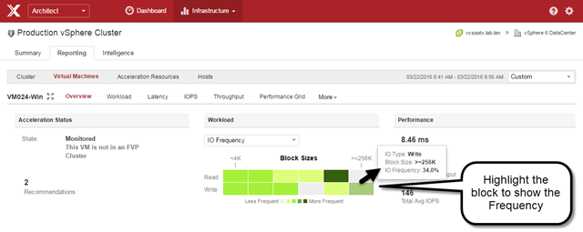
When looking at a particular VM, the "Overview" view in Architect can be used to show the frequency of I/O sizes across the spectrum of small blocks to large blocks for any time period you wish. This I/O frequency will show up on the main Summary page when viewing across the entire cluster. The image below focuses on just a single VM.

(Click on images for a full size view)

vmpete-summary

What is most interesting about the image above is that the frequency of block sizes, based on reads and writes are different. This is a common characteristic that has largely gone unnoticed because there has been no way to easily view that data in the first place.

Block sizes using a "Workload" View
The "Workload" view in Architect presents a distribution of block sizes in a percentage form as they occur on a single workload, a group of workloads, or across an entire vSphere cluster. The time frame can be any period that you wish. This view tells more clearly and quickly than any other view as to how complex, unique, and dynamic the distribution of block sizes are for any given VM. The example below represents a single workload, across a 15 minute period of time. Much like read/write ratios, or other metrics like CPU utilization, it’s important to understand these changes as they occur, and not just a single summation or percentage over a long period of time.

vmpete-workloadview

When viewing the "Workload" view in any real world environment, it will instantly provide new perspective on the limitations of Synthetic I/O generators. Their general lack of ability to emulate the very complex distribution of block sizes in your own environment limit their value for that purpose. The "Workload" view also shows how dramatic, and continuous the changes in workloads can be. This speaks volumes as to why one-time storage assessments are not enough. Nobody treats their CPU or memory resources in that way. Why would we limit ourselves that way for storage?

Keep in mind that the "Workload" view illustrates this distribution in a percentage form. Views that are percentage based aim to illustrate proportion relative to a whole. They do not show absolute values behind those percentages. The distribution could represent 50 IOPS, or 5,000 IOPS. However, this type of view can be an incredibly effective in identifying subtle changes in a workload or across an environment for short term analysis, or long term trending.

Block sizes in an IOPS and Throughput view
First let’s take a look at this VM by looking at IOPS, based on a default "Read/Write" breakdown. The image below shows a series of reads before a series of mostly writes. When you look back at the "Workload" view above, you can see how these I/Os were represented by block size distribution.

vmpete-IOPSrw

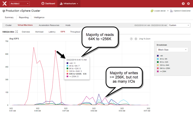
Staying on this IOPS view and selecting the predefined "Block Size" breakdown, we can see the absolute numbers that are occurring based on block size. The image below shows that unlike the "Workload" view above, this shows the actual number of I/Os issued for the given block size.

vmpete-IOPSblocksize

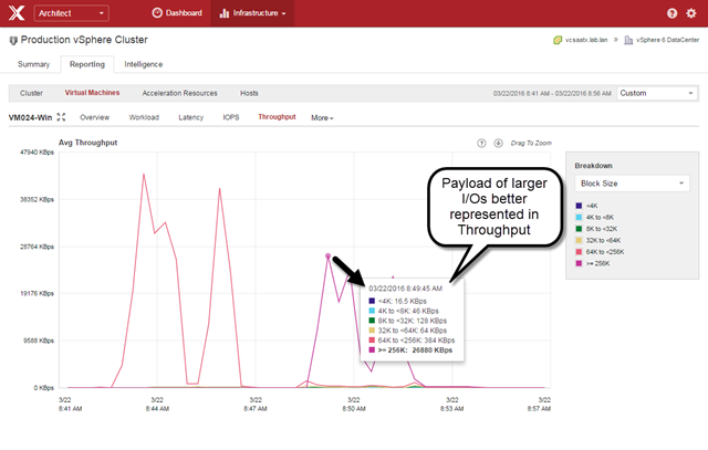
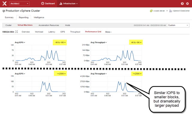
But that doesn’t tell the whole story. A block size is an attribute for a single I/O. So in an IOPS view 10 IOPS of 4K blocks looks the same as 10 IOPS of 256K blocks. In reality, the latter is 64 times the amount of data. The way to view this from a "payload amount transmitted" perspective is using the Throughput view with the "Block Size" breakdown, as shown below.

vmpete-TPblocksize

When viewing block size by its payload size (Throughput) as shown above, it provides a much better representation of the dominance of large block sizes, and the relatively small payload of the smaller block sizes.

Here is another way Architect can help you visualize this data. We can click on the "Performance Grid" view and change the view so that we have IOPS and Throughput but for specific block sizes. As the image below illustrates, the top row shows IOPS and Throughput for 4K to <8K blocks, while the bottom row shows IOPS and Throughput for blocks over 256K in size.

vmpete-performancegrid-IOPSTP

What the image above shows is that while the number of IOPS for block sizes in the 4K to <8K range at it’s peak were similar to the number of IOPS for block sizes of 256K and above, there was an enormous amount of payload delivered.

Why does it matter?
Let’s let PernixData Architect tell us why all of this matters. We will look at the effective latency of the VM over that same time period. We can see from the image below that the effective latency of the VM definitely increased as it transitioned to predominately writes. (Read/Write boxes unticked for clarity).

vmpete-Latencyrw

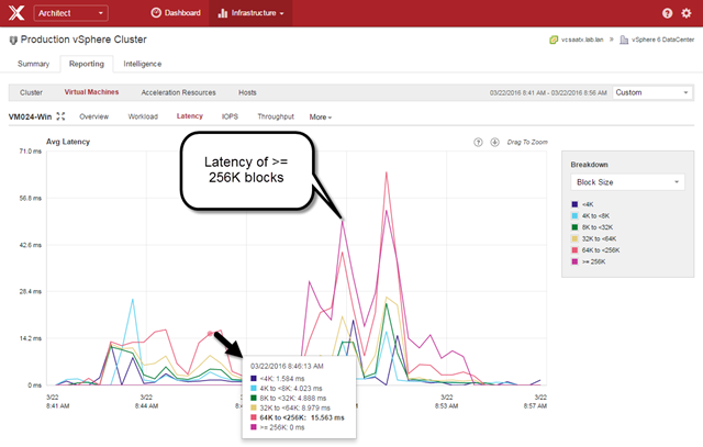
Now, let’s look at the image below, which shows latency by block size using the "Block Size" breakdown.

vmpete-Latency-blocksize

There you see it. Latency was by in large a result of the larger block sizes. The flexibility of these views can take an otherwise innocent looking latency metric and tell you what was contributing most to that latency.

Now let’s take it a step further. With Architect, the "Block Size" breakdown is a predefined view that shows block size characteristic of both reads, and writes combined – whether you are looking at Latency, IOPS, or Throughput. However, you can use a custom breakdown to not only show block sizes, but show them specifically for reads or writes, as shown in the image below.

vmpete-Latency-blocksize-custom

The "Custom" Breakdown for the Latency view shown above had all of the reads and writes of individual block sizes enabled, but some of them were simply "unticked" for clarity. This view confirms that the majority of latency was the result of writes that were 64K and above. In this case, we can clearly demonstrate that latency seen by the VM was the result of larger block sizes issued by writes. It’s impact however is not limited to just the higher latency of those larger blocks, as those large block latencies can impact the smaller block I/Os as well. Stay tuned for more information on that subject.

As shown in the image below, Architect also allows you to simply click on a single point, and drill in for more insight. This can be done on a per VM basis, or across the entire cluster. By hovering over each vertical bar representing various block sizes, it will tell you how many IOs were issued at that time, and the corresponding latency.

vmpete-Latency-Drilldown

Flash to the rescue?
It’s pretty clear that block size can have significant impact on the latency your applications see. Flash to the rescue, right?  Well, not exactly. All of the examples above come from VMs running on Flash. Flash, and how it is implemented in a storage solution is part of what makes this so interesting, and so impactful to the performance of your VMs. We also know that the storage media is just one component of your storage infrastructure. These components, and their abilities to hinder performance, exist regardless if one is using a traditional three-tier architecture, or distributed storage architectures like Hyper Converged environments.

Block sizes in the Performance Matrix
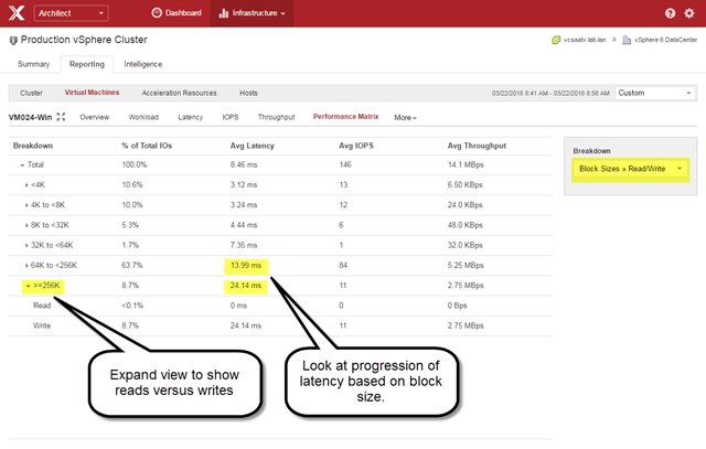
One unique view in Architect is the Performance Matrix. Unique in what it presents, and how it can be used. Your storage solution might have been optimized from the Manufacturer based on certain assumptions that may not align with your workloads. Typically there is no way of knowing that. As shown below, Architect can help you understand what type of workload characteristics in which the array begins to suffer.

vmpete-PeformanceMatrix

The Performance Matrix can be viewed on a per VM basis (as shown above) or in an aggregate form. It’s a great view to see what block size thresholds your storage infrastructure may be suffering, as the VMs see it. This is very different than statistics provided by an array, as Architect offers a complete, end-to-end understanding of these metrics with extraordinary granularity. Arrays are not in the correct place to accurately understand, or measure this type of data.

Summary
Block sizes have a profound impact on the performance of your VMs, and is a metric that should be treated as a first class citizen just like compute and other storage metrics. The stakes are far too high to leave this up to speculation, or words from a vendor that say little more than "Our solution is fast. Trust us.Architect leverages it’s visibility of block sizes in ways that have never been possible. It takes advantage of this visibility to help you translate what it is, to what it means for your environment.

Understanding block sizes in a virtualized environment

Cracking the mysteries of the Data Center is a bit like space exploration. You think you understand what everything is, and how it all works together, but struggle to understand where fact and speculation intersect. The topic of block sizes, as they relate to storage infrastructures is one such mystery. The term being familiar to some, but elusive enough to remain uncertain as to what it is, or why it matters.

This inconspicuous, but all too important characteristic of storage I/O has often been misunderstood (if not completely overlooked) by well-intentioned Administrators attempting to design, optimize, or troubleshoot storage performance. Much like the topic of Working Set Sizes, block sizes are not of great concern to an Administrator or Architect because of this lack of visibility and understanding. Sadly, myth turns into conventional wisdom – in not only what is typical in an environment, but how applications and storage systems behave, and how to design, optimize, and troubleshoot for such conditions.

Let’s step through this process to better understand what a block is, and why it is so important to understand it’s impact on the Data Center.

What is it?
Without diving deeper than necessary, a block is simply a chunk of data. In the context of storage I/O, it would be a unit in a data stream; a read or a write from a single I/O operation. Block size refers the payload size of a single unit. We can blame a bit of this confusion on what a block is by a bit of overlap in industry nomenclature. Commonly used terms like blocks sizes, cluster sizes, pages, latency, etc. may be used in disparate conversations, but what is being referred to, how it is measured, and by whom may often vary. Within the context of discussing file systems, storage media characteristics, hypervisors, or Operating Systems, these terms are used interchangeably, but do not have universal meaning.

Most who are responsible for Data Center design and operation know the term as an asterisk on a performance specification sheet of a storage system, or a configuration setting in a synthetic I/O generator. Performance specifications on a storage system are often the result of a synthetic test using the most favorable block size (often 4K or smaller) for an array to maximize the number of IOPS that an array can service. Synthetic I/O generators typically allow one to set this, but users often have no idea what the distribution of block sizes are across their workloads, or if it is even possibly to simulate that with synthetic I/O. The reality is that many applications draw a unique mix of block sizes at any given time, depending on the activity.

I first wrote about the impact of block sizes back in 2013 when introducing FVP into my production environment at the time. (See section "The IOPS, Throughput & Latency relationship")  FVP provided a tertiary glimpse of the impact of block sizes in my environment. Countless hours with the performance graphs, and using vscsistats provided new insight about those workloads, and the environment in which they ran. However, neither tool was necessarily built for real time analysis or long term trending of block sizes for a single VM, or across the Data Center. I had always wished for an easier way.

Why does it matter?
The best way to think of block sizes is how much of a storage payload consisting in a single unit.  The physics of it becomes obvious when you think about the size of a 4KB payload, versus a 256KB payload, or even a 512KB payload. Since we refer to them as a block, let’s use a square to represent their relative capacities.

image

Throughput is the result of IOPS, and the block size for each I/O being sent or received. It’s not just the fact that a 256KB block has 64 times the amount of data that a 4K block has, it is the amount of additional effort throughout the storage stack it takes to handle that. Whether it be bandwidth on the fabric, the protocol, or processing overhead on the HBAs, switches, or storage controllers. And let’s not forget the burden it has on the persistent media.

This variability in performance is more prominent with Flash than traditional spinning disk.  Reads are relatively easy for Flash, but the methods used for writing to NAND Flash can inhibit the same performance results from reads, especially with writes using large blocks. (For more detail on the basic anatomy and behavior of Flash, take a look at Frank Denneman’s post on Flash wear leveling, garbage collection, and write amplification. Here is another primer on the basics of Flash.)  A very small number of writes using large blocks can trigger all sorts of activity on the Flash devices that obstructs the effective performance from behaving as it does with smaller block I/O. This volatility in performance is a surprise to just about everyone when they first see it.

Block size can impact storage performance regardless of the type of storage architecture used. Whether it is a traditional SAN infrastructure, or a distributed storage solution used in a Hyper Converged environment, the factors, and the challenges remain. Storage systems may be optimized for different block size that may not necessarily align with your workloads. This could be the result of design assumptions of the storage system, or limits of their architecture.  The abilities of storage solutions to cope with certain workload patterns varies greatly as well.  The difference between a good storage system and a poor one often comes down to the abilities of it to handle large block I/O.  Insight into this information should be a part of the design and operation of any environment.

The applications that generate them
What makes the topic of block sizes so interesting are the Operating Systems, the applications, and the workloads that generate them. The block sizes are often dictated by the processes of the OS and the applications that are running in them.

Unlike what many might think, there is often a wide mix of block sizes that are being used at any given time on a single VM, and it can change dramatically by the second. These changes have profound impact on the ability for the VM and the infrastructure it lives on to deliver the I/O in a timely manner. It’s not enough to know that perhaps 30% of the blocks are 64KB in size. One must understand how they are distributed over time, and how latencies or other attributes of those blocks of various sizes relate to each other. Stay tuned for future posts that dive deeper into this topic.

Traditional methods capable of visibility
The traditional methods for viewing block sizes have been limited. They provide an incomplete picture of their impact – whether it be across the Data Center, or against a single workload.

1. Kernel statistics courtesy of vscsistats. This utility is a part of ESXi, and can be executed via the command line of an ESXi host. The utility provides a summary of block sizes for a given period of time, but suffers from a few significant problems.

  • Not ideal for anything but a very short snippet of time, against a specific vmdk.
  • Cannot present data in real-time.  It is essentially a post-processing tool.
  • Not intended to show data over time.  vscsistats will show a sum total of I/O metrics for a given period of time, but it’s of a single sample period.  It has no way to track this over time.  One must script this to create results for more than a single period of time.
  • No context.  It treats that workload (actually, just the VMDK) in isolation.  It is missing the context necessary to properly interpret.
  • No way to visually understand the data.  This requires the use of other tools to help visualize the data.

The result, especially at scale, is a very labor intensive exercise that is an incomplete solution. It is extremely rare that an Administrator runs through this exercise on even a single VM to understand their I/O characteristics.

2. Storage array. This would be a vendor specific "value add" feature that might present some simplified summary of data with regards to block sizes, but this too is an incomplete solution:

  • Not VM aware.  Since most intelligence is lost the moment storage I/O leaves a host HBA, a storage array would have no idea what block sizes were associated with a VM, or what order they were delivered in.
  • Measuring at the wrong place.  The array is simply the wrong place to measure the impact of block sizes in the first place.  Think about all of the queues storage traffic must go through before the writes are committed to the storage, and reads are fetched. (It also assumes no caching tiers outside of the storage system exist).  The desire would be to measure at a location that takes all of this into consideration; the hypervisor.  Incidentally, this is often why an array can show great performance on the array, but suffer in the observed latency of the VM.  This speaks to the importance of measuring data at the correct location. 
  • Unknown and possibly inconsistent method of measurement.  Showing any block size information is not a storage array’s primary mission, and doesn’t necessarily provide the same method of measurement as where the I/O originates (the VM, and the host it lives on). Therefore, how it is measured, and how often it is measured is generally of low importance, and not disclosed.
  • Dependent on the storage array.  If different types of storage are used in an environment, this doesn’t provide adequate coverage for all of the workloads.

The Hypervisor is an ideal control plane to analyze the data. It focuses on the results of the VMs without being dependent on nuances of in-guest metrics or a feature of a storage solution. It is inherently the ideal position in the Data Center for proper, holistic understanding of your environment.

Eyes wide shut – Storage design mistakes from the start
The flaw with many design exercises is we assume we know what our assumptions are. Let’s consider typical inputs when it comes to storage design. This includes factors such as

  • Peak IOPS and Throughput.
  • Read/Write ratios
  • RAID penalties
  • Perhaps some physical latencies of components, if we wanted to get fancy.

Most who have designed or managed environments have gone through some variation of this exercise, followed by a little math to come up with the correct blend of disks, RAID levels, and fabric to support the desired performance. Known figures are used when they are available, and the others might be filled in with assumptions.  But yet, block sizes, and everything they impact are nowhere to be found. Why? Lack of visibility, and understanding.

If we know that block sizes can dramatically impact the performance of a storage system (as will be shown in future posts) shouldn’t it be a part of any design, optimization, or troubleshooting exercise?  Of course it should.  Just as with working set sizes, lack of visibility doesn’t excuse lack of consideration.  An infrastructure only exists because of the need to run services and applications on it. Let those applications and workloads help tell you what type of storage fits your environment best. Not the other way around.

Is there a better way?
The ideal approach for measuring the impact of block sizes will always include measuring from the location of the hypervisor, as this will provide these measurements in the right way, and from the right location.  vscsiStats and vCenter related metrics are an incredible resource to tap into, and will provide the best understanding on impacts of block sizes in a storage system.  There may be some time investment to decipher block size characteristics of a workload, but the payoff is generally worth the effort.